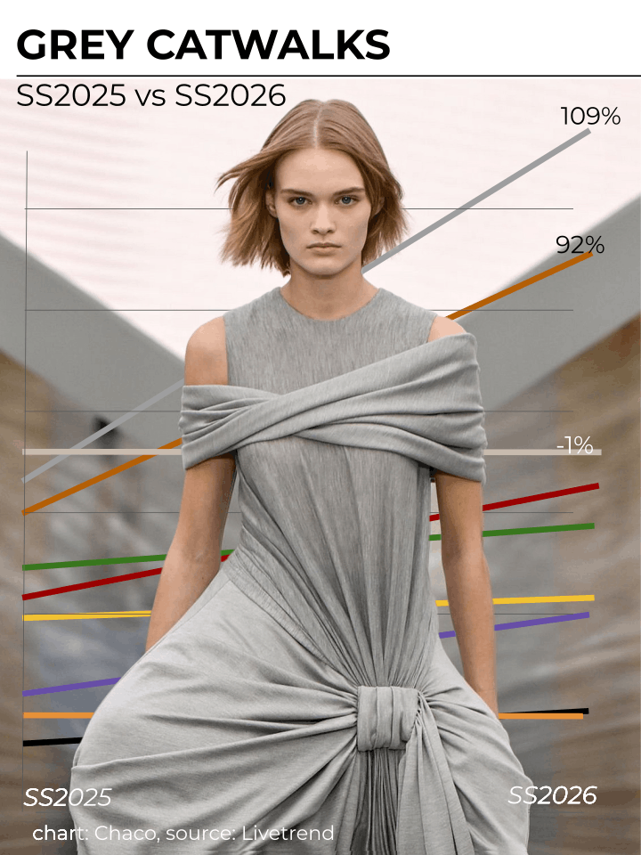
AGE OF GREIGE
Why the world is losing its colours and what it means for brands.
Look down: what colors are you wearing right now? Chances are it’s black, white, grey—or something pretending not to be, like blue.
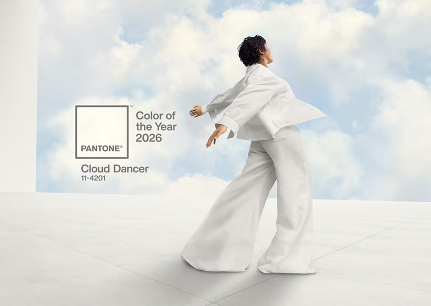
It isn’t just you; everywhere, colour is in retreat. Cars, clothes, architecture, and everyday objects are significantly more muted than they were 50 years ago. Tellingly, Pantone’s 2026 Color of the Year isn’t even a color: it is Cloud Dancer White.
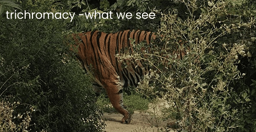
But colour is more than an aesthetic choice—it is the vital data that ensured our survival. For millennia, trichromacy (color vision) allowed us to identify nutrient rich foods, healthy mates, and venomous threats.
I see a rainbow and I want it painted black
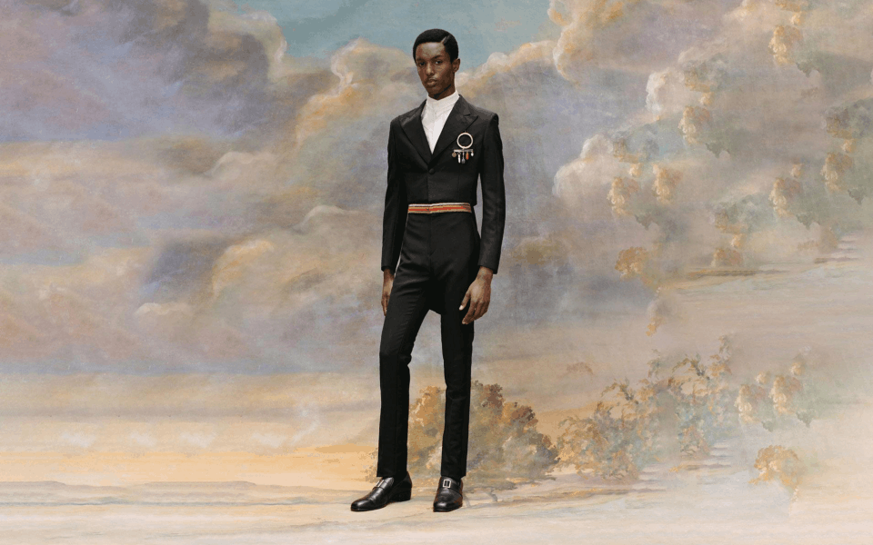
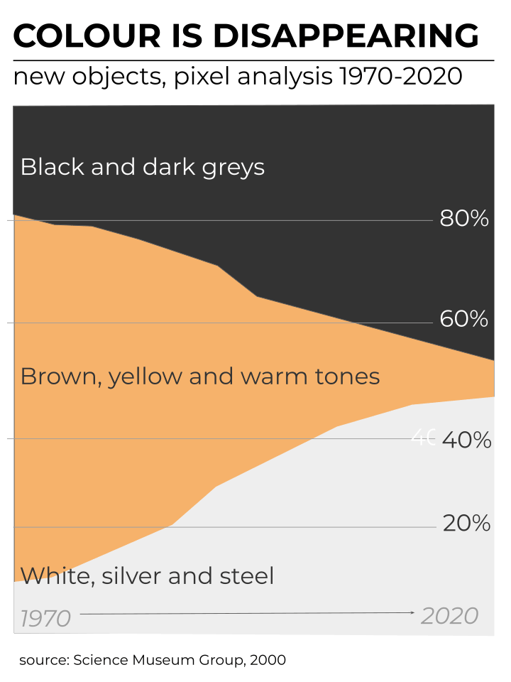
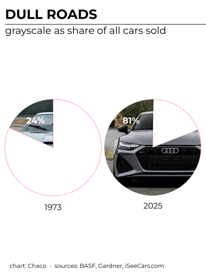
The retreat of colour is not a matter of perception; it is a measurable collapse across every sector of our physical environment.
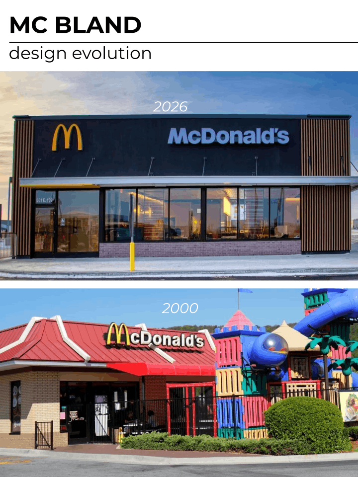
The “McDonald’s Effect” is a prime example of corporate debranding. In an effort to signal sophistication, the brand stripped its 40,000 restaurants of playful colours adopting the desaturised palettes of the tech and coffee industries instead. In 2009, they went as far as replacing the vibrant red background of their logo with a Hunter Green in Europe.
All about the Benjamins
Why is this happening? The causes are a convergence of risk-aversion and optimization:
- The Apple Effect: Brands use muted palettes to signal “adult” or premium status (think Tesla, Nest).
- The Landlord Special: Zillow data shows that neutral, “Safe” colours can increase a home’s resale value by up to $5,000.
- Supply Chain Logic: “Universal tones” minimize exposure to trend volatility, allowing global brands to stock the same inventory in London as in Tokyo without risk of cultural mistranslation (witness the contrasting fortunes of Benetton and Muji).
Somewhere over the Rainbow
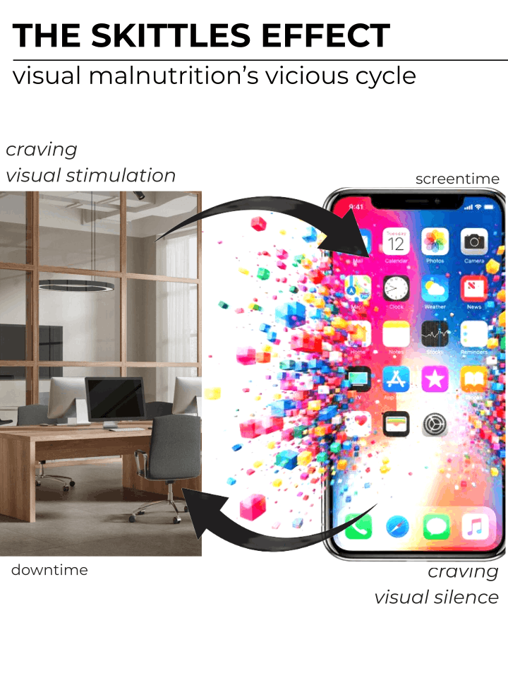
But you could argue that colour hasn’t disappeared, it just migrated from the atoms to the pixels around us. Seen that way, you realise the rise of Greige coincides with that of record mobile screentime.
Together those two forces paint a dramatic picture: the more sterile our physical world becomes, the more we crave the dopamine rewards of “visual nutrition”. A biological need weaponised by app developers and content creators to their advantage, with hyper-saturated interfaces that boost our engagement. Mobile screentime went from 30 mins in 2000 to over 9 hours a day in 2025 in the case of Gen Z.
Sadly, the more time we spend on our screens, the more we crave the visual silence of a dull physical world, starting the cycle all over again.
Come on Barbie, let’s go party
Some have begun to take action by turning their mobile on grayscale mode to strip away the dopamine-triggering visual rewards used by app developers to keep them scrolling, and redecorating their flats with bright colours that “bring joy”. Given the record number of hours Gen Z spend staring at a screen, it is unsurprising they are the key proponents of both of these trends…and flaunting them online: #DopamineRoom amasses millions of views onTikTok.
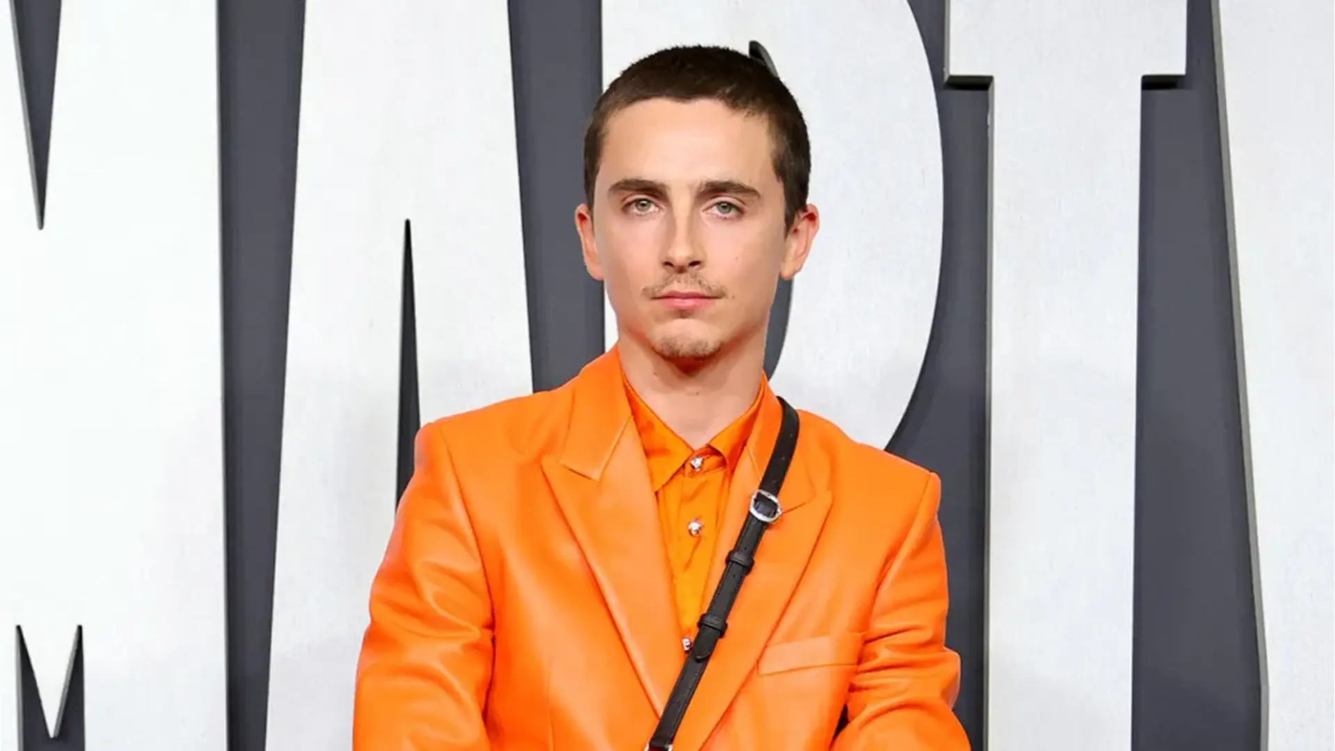
Orange is the new pink
Neutral colours clearly have their advantages, but the rising sea of grey offers an edge to those willing to go against the trend, and not just for those with established colours like Tiffany, Virgin or Veuve.
In a move that would have barely registered in the age of technicolor, Timothée Chalamet’s strategic use of orange in the weeks leading up to the release of Marty Supreme helped the indie studio A24 beat Warner Brother’s One Battle After Another at the box office. The choice was deliberate…and inspired by another strategic use of colour: WB’s choice of pink to promote Barbie 2 years earlier. Take that, Leo.