


AMERICAN FARM WORKS: FROM PRIVATE LABEL TO PROUD BRAND
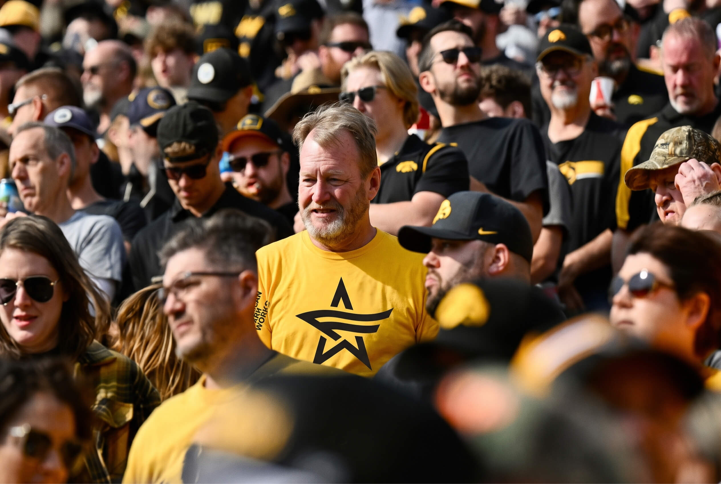
American Farm Works is the #1 electric fence brand in the USA. Under pressure from cheap imports it was losing share rapidly and Chaco was brought it in to redesign its packaging in hopes of reviving sales.
But along the way we uncovered evidence, from its unimprovable name to cultural shifts, that pointed to a larger opportunity.
ASK:
1- Reskinning of 13 SKUs (packaging redesign)
DELIVERED:
1- Strategy: complete brand repositioning.
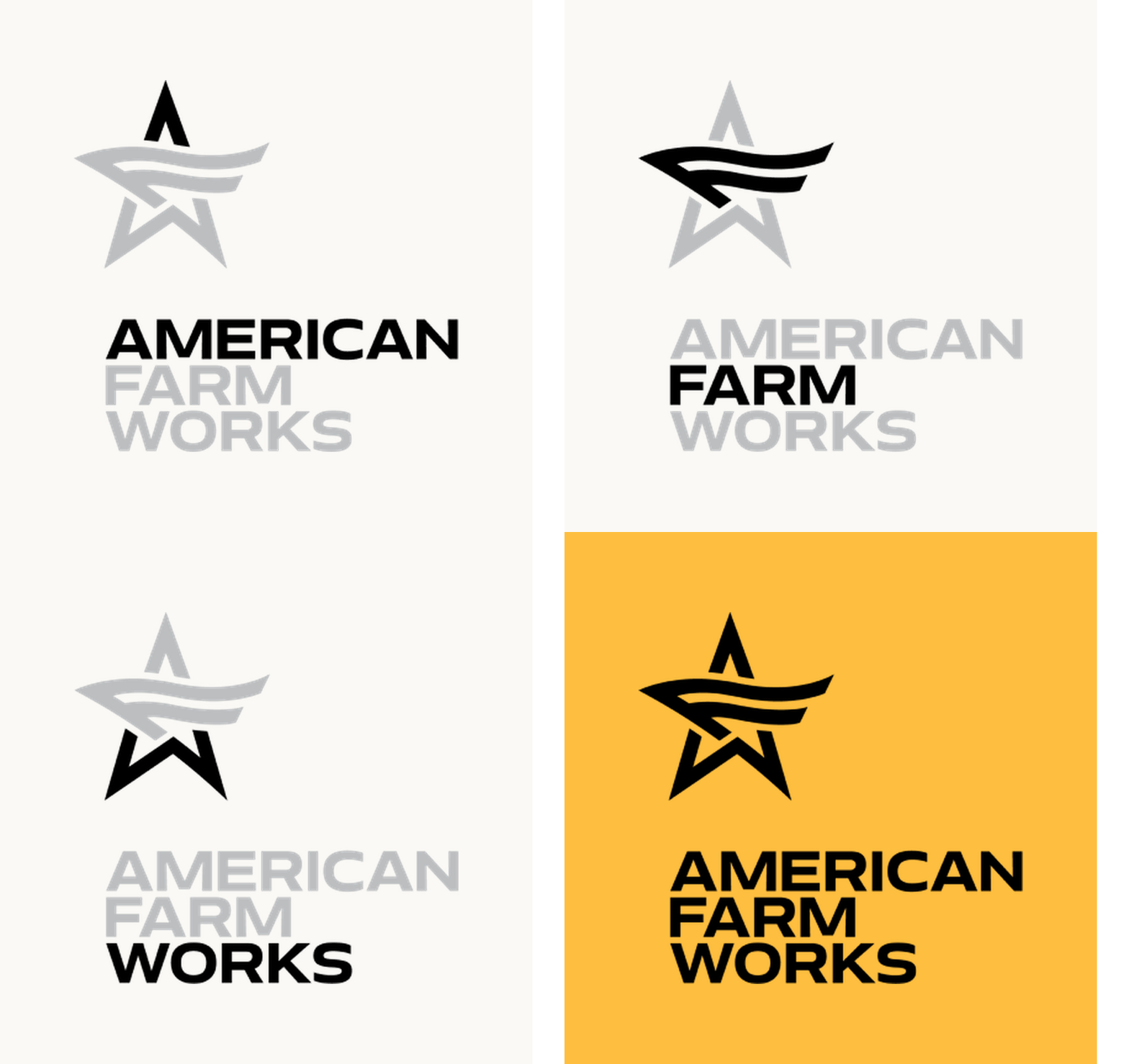
2- Design: complete redesign of brand ID with full visual identity system — logo, color, typography, motion and pattern language — for consistent brand expression across categories and SKUs.
3- Design: redesign of electric fencing packaging range to boost shopability.
FOUR MAJOR SHIFTS
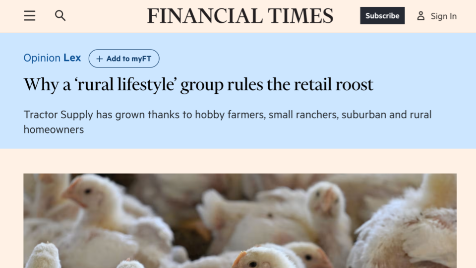
The Scale of TSC’s Private-Label Engine: While Tractor Supply owes a third of its $15B revenue to private labels, everyday farm maintenance and chore tools remained fractured across unbranded, generic commodity labels.
The Premiumisation of Private Label: going from “cheap generic knockoffs” to curated, mission-led proprietary brands (e.g. Trader Joe’s, Kirkland Signature or Target’s Good & Gather) helped private labels sales grow at double the rate of national brands to reach $230B annually.
The Post-COVID Surge in Small Farming: a massive wave of younger homeowners took up hobby homesteading after the Pandemic. When they walked into TSC they felt completely intimidated by legacy jargon and turned to Reddit, YouTube, and ChatGPT in the aisles.
The Cultural Realignment: After the Biden years, consumer sentiment shifted away from abstract corporate initiatives and toward tangible, domestic resilience. “Made in the USA” became the single strongest purchase driver across the American heartland. Yet AFW—manufactured right in Tennessee—didn’t even feature a “Made in the USA” callout on its boxes.
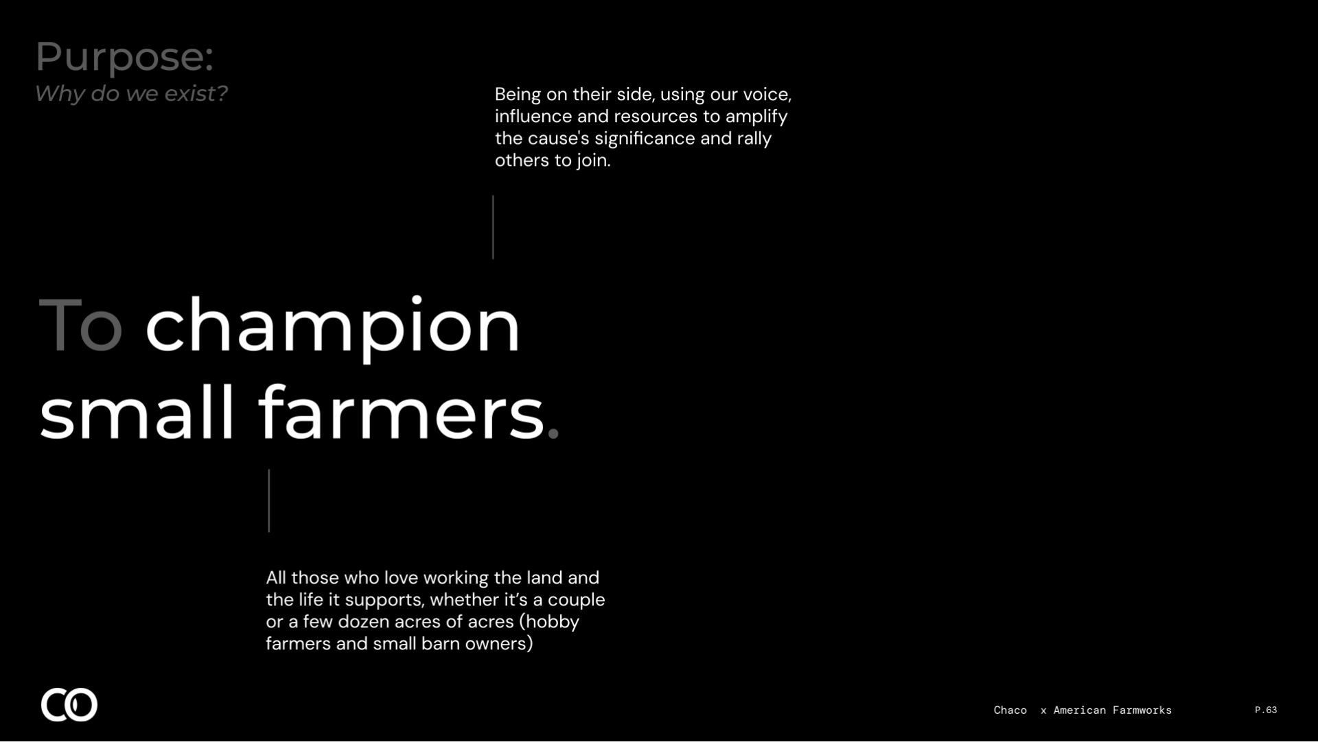
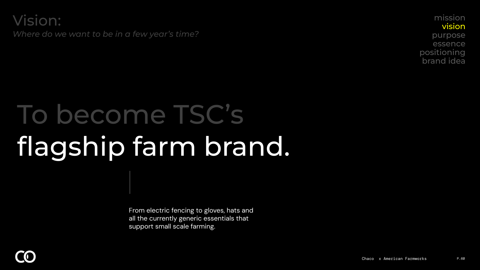
The conclusion was undeniable: keeping American Farm Works trapped in a $125M electric fencing niche was leaving millions on the table. It should instead become TSC’s anchor umbrella brand across the entire small-farm ecosystem—from heavy-duty work gloves and digging tools to buckets, hardware, and perimeter containment.
Brilliant, but it was not meant to be. Corporate decisions made miles away decided to walk away from this opportunity after all the work was created and assets delivered. But never let such facts get in the way of a great case study, as Mark Twain would have said had he he been a marketer.
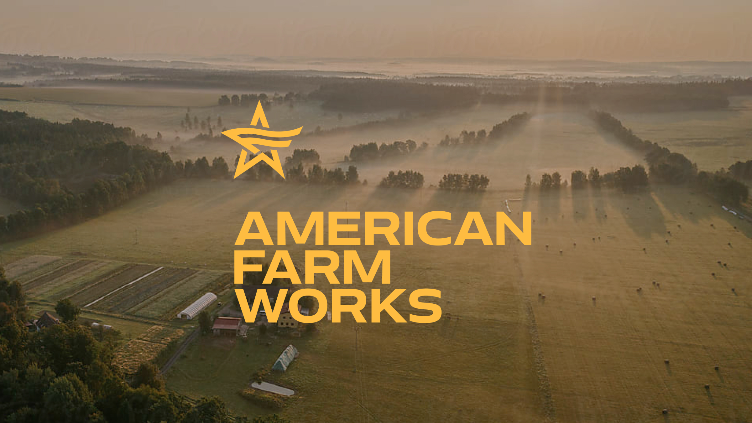
before and after
use slider to see the difference
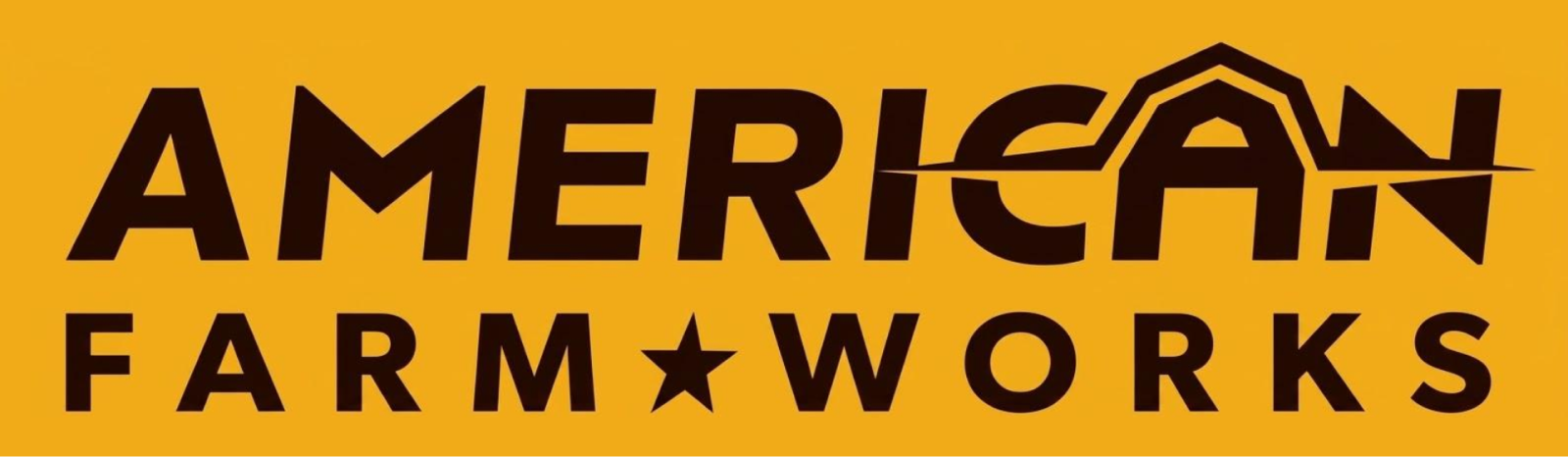

AN UNIMPROVABLE NAME
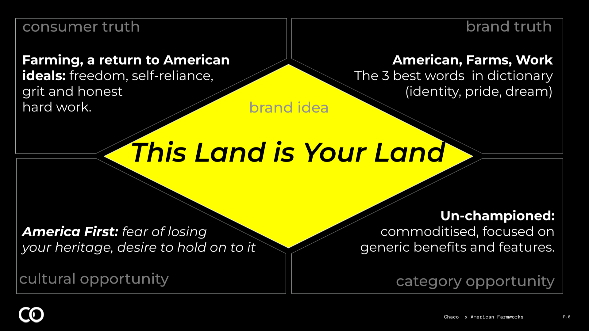
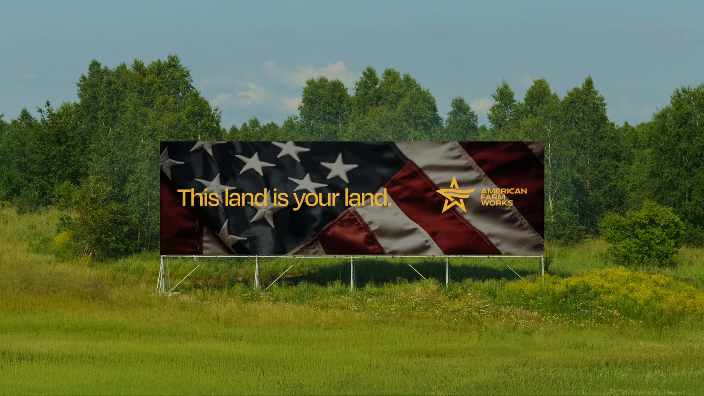
To its audience, American, Farm and Work are some of the most beautiful words in the English language. They represent the values that define them as people and made this country great in the first place. In other words: the seeds that could galvanize the community of small farmers around its most primal instincts. So we went all in.
PACK REDESIGN
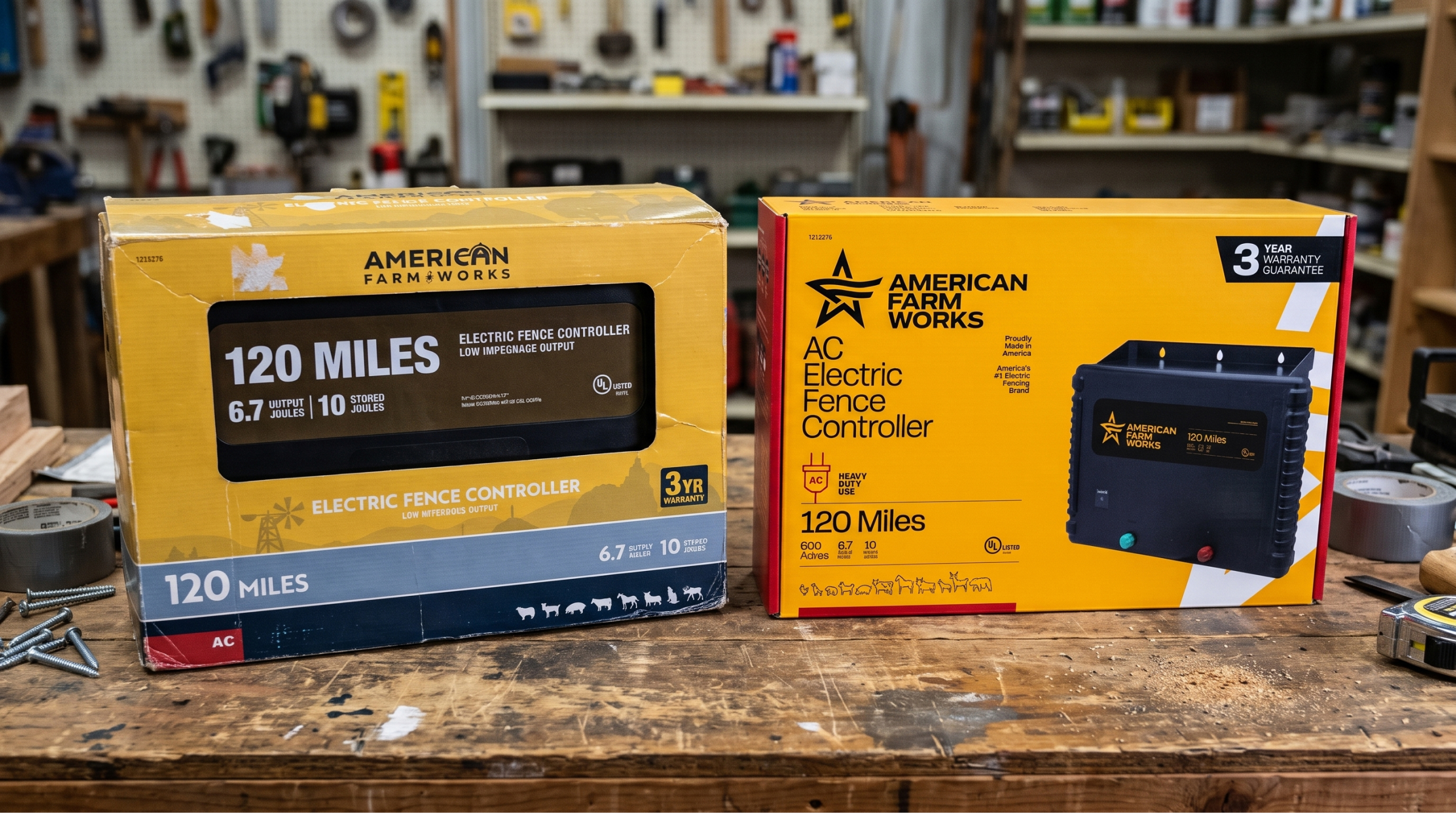
The legacy packaging had the look of an undifferentiated store brand. With the product hiding behind an awkward die-cut window that only exposed a label with redundant copy. This crowded out critical specs, left buyers guessing what the units actually looked like, how to install them, and critically made no mention of its American origin.
Chaco redesigned it with high-impact semiotics: industrial typography, full product visibility, bold mileage and acreage hierarchies, with prominent “Proudly Made in America” and “#1 Brand” credentials—transforming a confusing commodity box into an authoritative, shelf-defining leader. The same rigour and information hierarchy was applied to all products consistently, improving shopability across the range.
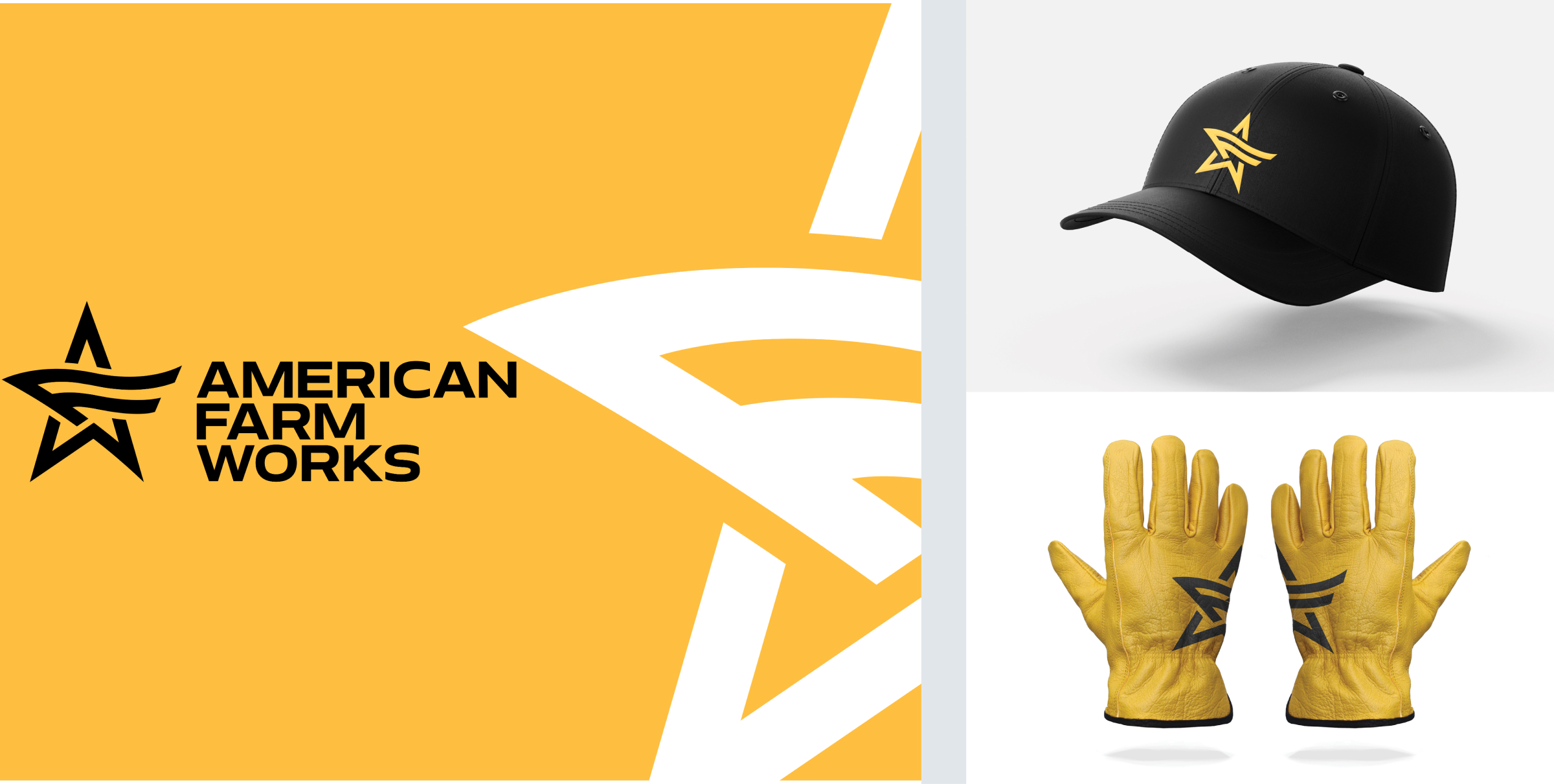
TYPOGRAPHY
Industrial Authority With Instant Legibility
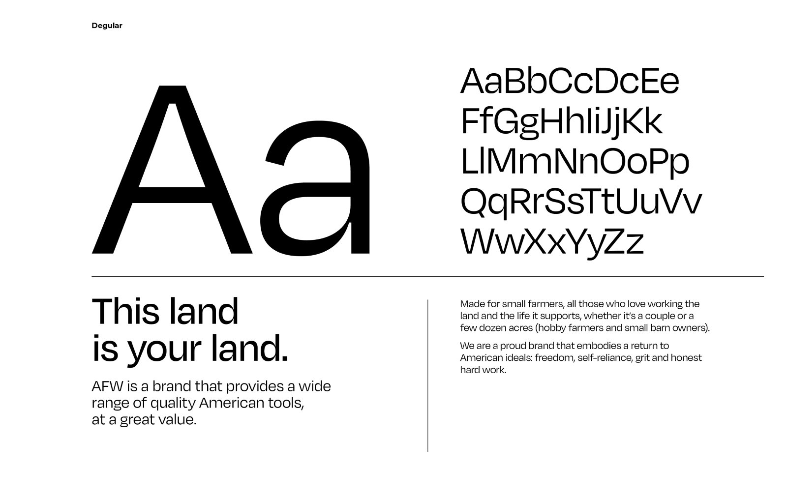
Primary Headline & Display: Bold, condensed, clean-grotesque industrial sans-serif lettering reminiscent of vintage farm machinery stencils and American workshop tools—engineered to project authority and readability from 15 feet down the aisle.
Instructive Secondary Body: A highly legible geometric sans for step-by-step panel instructions, wiring diagrams, and setup checklists, ensuring total legibility even in small point sizes on secondary faces.
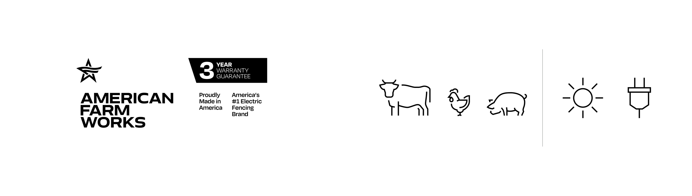
ICONOGRAPHY: Replaced minimalistic, vague animal silhouettes with distinct, accurate wildlife and livestock profiles grouped clearly by tier—eliminating duplication so shoppers immediately see why a 60-mile unit is needed over a 15-mile unit.
SYSTEM DIAGRAMS: Back and side panels were rebuilt as visual schematics showing complete fence assemblies—clearly illustrating insulators, grounding rods, and gate handles to de-intimidate the setup and turn the box into an active cross-merchandising tool.
WHAT TO BUY?
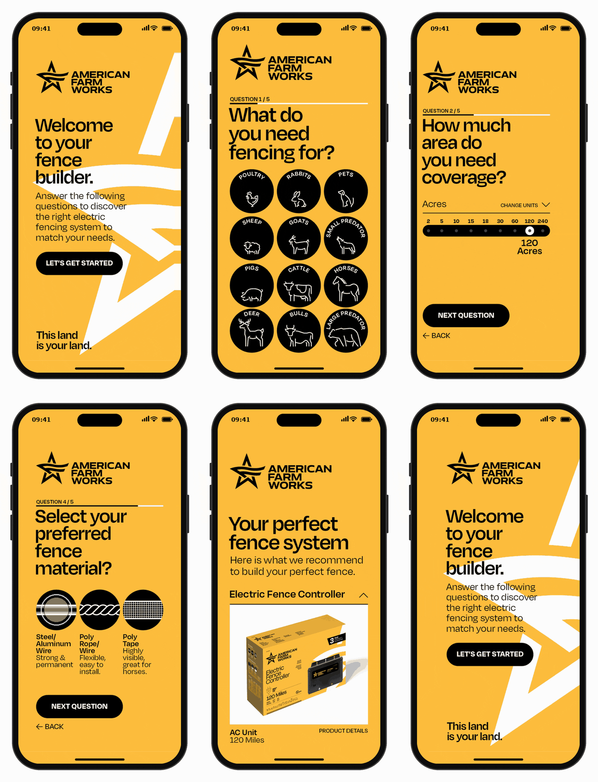
You don’t buy electric fences everyday. To improve shopability among new consumers, Chaco created a simple “Fence Builder” tool that guides users to the right product by asking just 5 straight-forward questions, right on their phones.
PHOTOGRAPHY
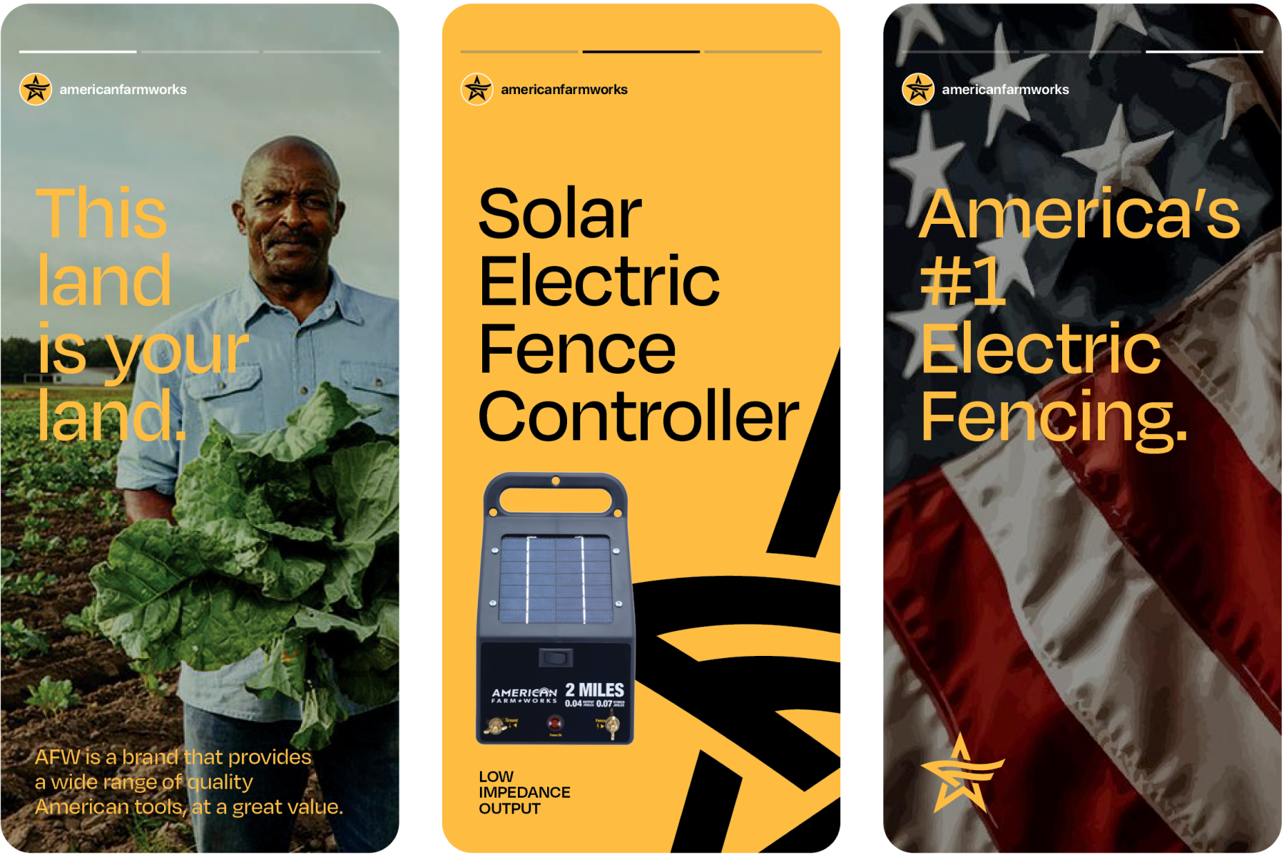
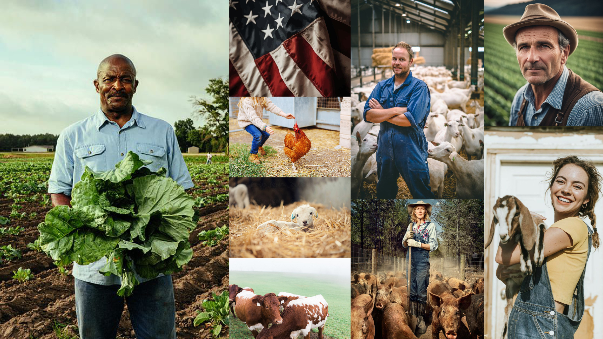
A store brand doesn’t always need custom imagery. With a clear brief, well sourced stock imagery works wonders: no models, no styling, no stock-farm clichés. Just real working people: weathered hands, mud on the boots, pride without posing. Small farmers have to see themselves in AFW.
“Absolutely love it. This is by far the most serious and comprehensive work I’ve seen on any brand in this category. Thank you Chaco, I legit feel like it’s Christmas.”
-Daniel Petroff, VP, GM Animal Containment. Woodstream