VICTOR: REiNVIGORATING AN AMERICAN ICON
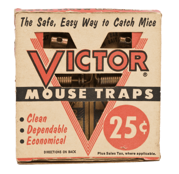
Victor invented the mouse trap in 1898 and today sells over 70m of theam each year. Yet, years of competing on price had eroded its equity, with every key indicator of brand health lagging behind its competitors’.
To turn the tide, the first call was hiring the company’s first CMO. The second was partnering with Chaco.
ASK:
1- Identify a positioning that would reignite market relevance and employee morale
2- Design a new brand identity to reflect it , from logo to packaging
3- Modernise current products with new prototypes that could inspire the industrial design team


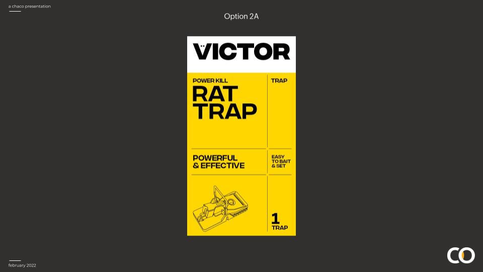
Red was only maintained in the iconic V. Everywhere else yellow and black were given prominence to distinguish the brand from competitors, emphasising the performance and technical aspects of the brand.
A warmer tone of yellow was also adopted to further distance Victor from any associations to private label.

STRATEGY
We found 3 main emotions involved in rodent control: Disgust, Shame and Guilt. While competitors fanned the flames of the first two in order to sell their poisons and glue traps, we saw an opportunity to address the third with Victor’s sometimes deadly but always effective and cruelty-free solutions. Interrogating the context further we arrived at the new brand idea.


The line does many things well: it captures both the desired result and the inherent consumer apprehension (nobody buys mouse traps because they want to), and it telegraphes the brand’s performance while depositioning competitors. Importantly it also provides an internal mantra, a reminder for employees of what made the brand great in the first place: because the way you do anything, is the way you do everything.
Now we were ready for the rebrand: modernising the existing identity and bringing that new-found confidence to the entire range, from the language of internal manuals to the redesign of existing products.
Used over decades on hundreds of millions of products, the red V was the most important visual asset of the brand.
Chaco sought to maintain this icon while simplying it for the digital age: any superfluous element was removed, signifying the brand’s resolve and ambition in its third century.

before and after
use slider to see the difference


“Chaco brings exactly the kind of strategic vision and design discipline iconic brands like Victor need to win. With reverence for history and hunger for the future, they fell in love with a category others deem stagnant, gaining unparalleled clarity to create a vision our entire company can get behind.”
-João Rodrigues, CMO Victor.
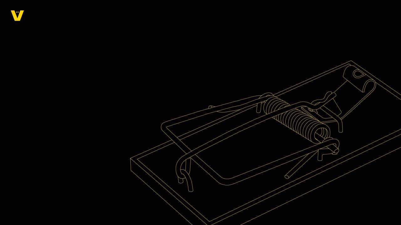
Fil rouge. Over the decades, Victor’s products had all been designed by different teams, in time becoming a collection of almost unrelated devices.
Chaco was tasked with creating a unifying look, redesigning them as an instantly recogniseable family of modern, high performing products.


before and after
use slider to see the difference
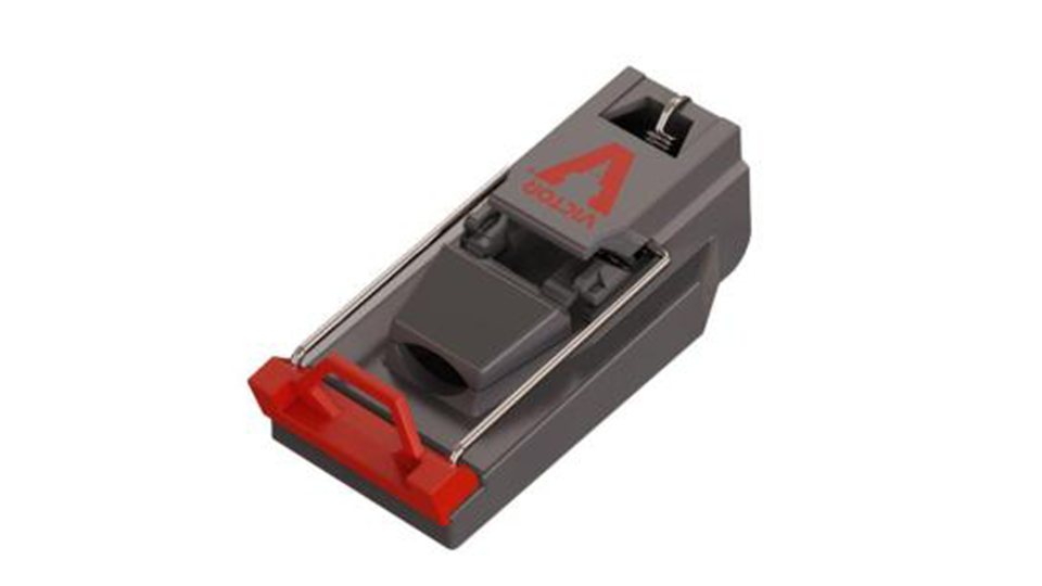
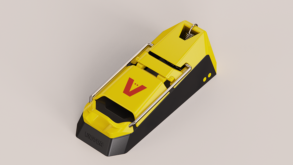
A better mouse trap
Victor knows the future is in our phones. The app interface was redesigned for a better user and brand experience.

I am such a big fan of what you’ve done for Victor: it’s just phenomenal, it’s exciting, it’s so much fun to talk about. I loved sitting with our largest customer and telling them about it.
Craig Wirth, President Woodstream corp.


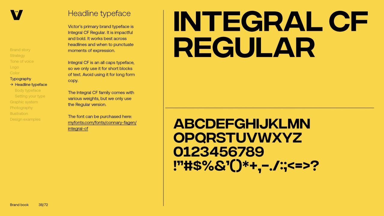
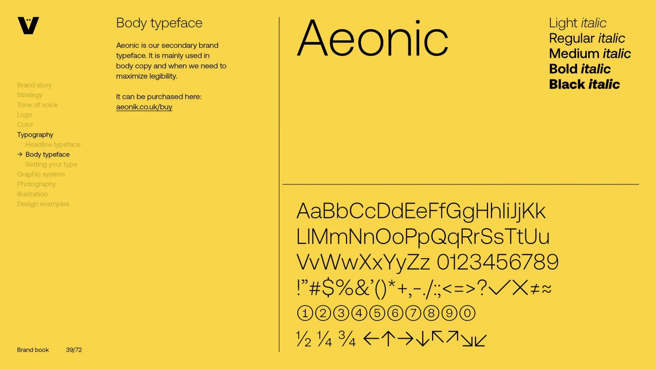
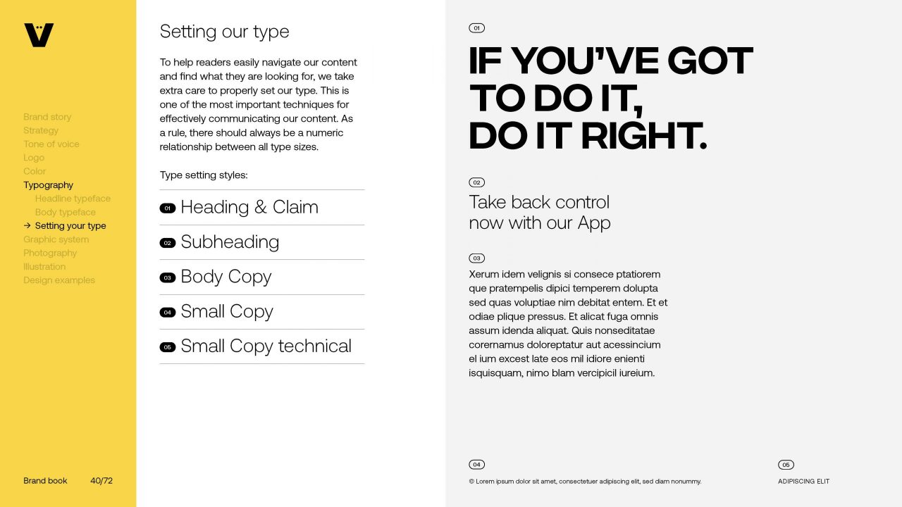
Typography was entirely revisited, with a flexible system that allows for boldness and impact as well as maximum legibility.
Swipe left for more.
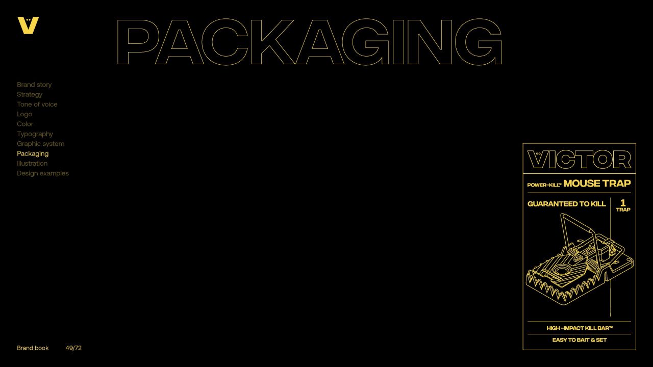
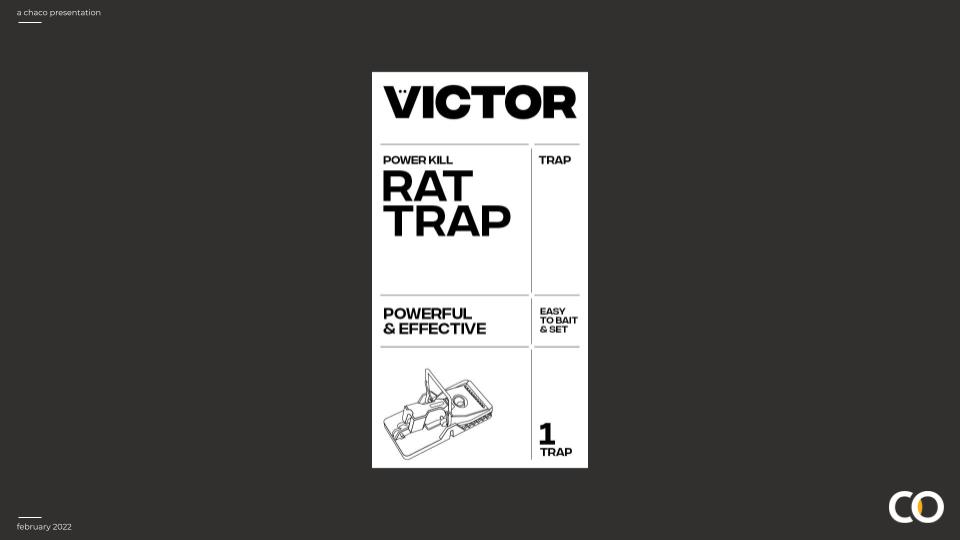
From value to performance: leveraging the semiotics of performance from techical drawings, packaging was completly overhauled to reflect the new strategy.
What was once an array of different blisters and packs following conflicting principles is now a range of carefully designed boxes, with clear message hierarchy and a better unboxing experience.
Swipe left for more.